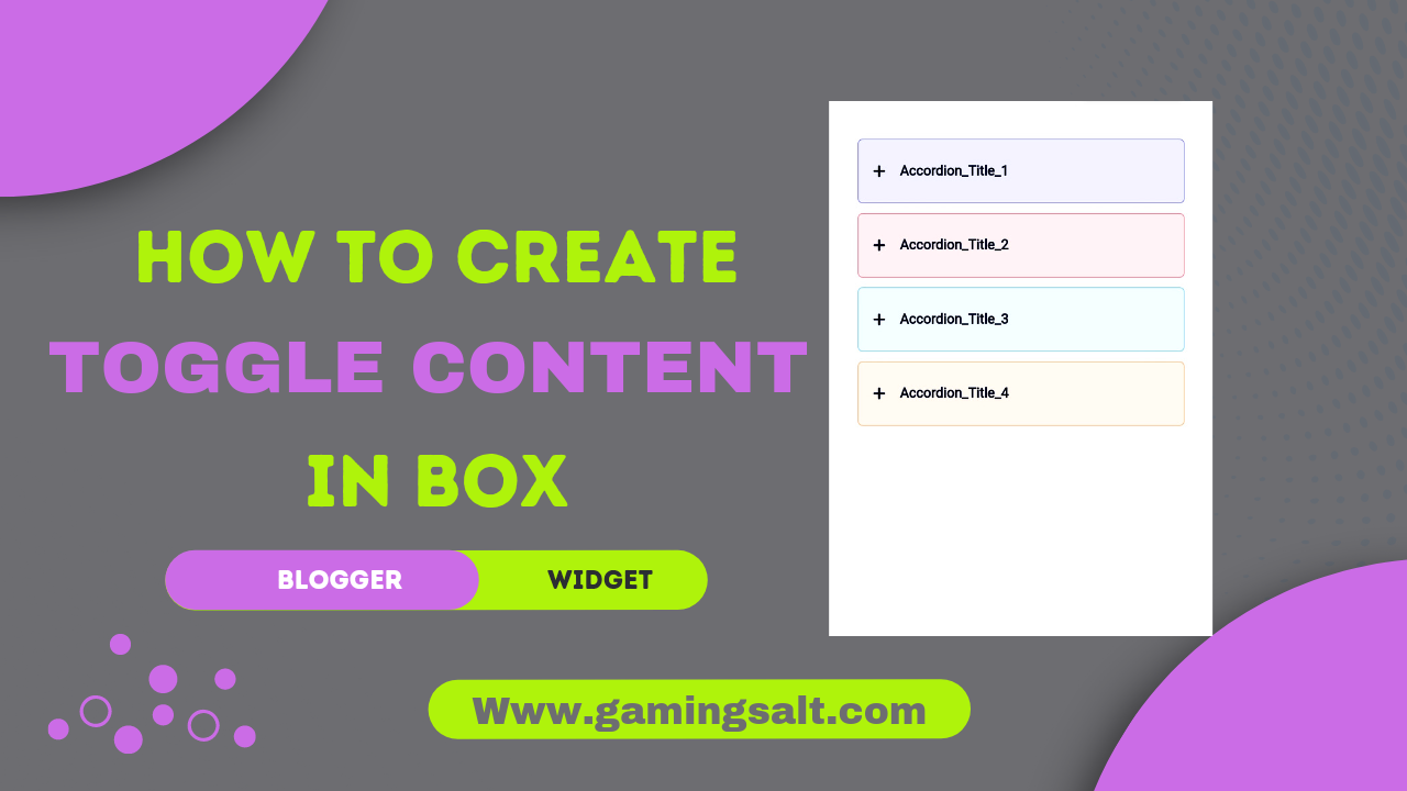
A single-page document with numerous sections is known as an accordion. At each level, one section is shown while the others are buried.
When dealing with really long questions, where you need to display only the first half of the question text and provide a "open more" link for the second half, this is helpful for fitting vast amounts of information into small spaces.
Benifits of toggle content or according section Widget-
According or toggle sections are helpful for nearly any kind of lengthy information, such as guides and tutorials. This guide will show you How To Create Colourfull Toggle Content Or Accordion Section On Blogger. This can be used on your blog as is or customised.
On the basis of debating the advantages and disadvantages of such choices, the article discusses the building of an accordion of FAQ for articles in blogs using CSS and HTML. Maintenance, accessibility, code readability, and other aspects are presumptions.
What is according Section?
A flexible content widget, the accordion may nicely display a number of objects. It frequently serves to display data or links (in this case, we will use it to display ads). Having open or closed buttons to expand/collapse the material is useful.
Any object can be automatically expanded and collapsed using the accordion function by simply clicking on it. Each sub-item will be presented in accordance with the level of an accordion, which means that when one portion expands, the next section contracts and vice versa.
Bloggers use the accordion, particularly on personal or small company blogs. It's simple to build and use this content organising strategy on your website.
So without wasting important time let's check How To Create Morden Colourfull Toggle Content Or Accordion Section Widget On Blogger.
You can see the demo here:-
How To Creat Morden Colorfull Toggle Content Or According Section Widget On Blogger?
ImportantBefore we start adding codes in XML, I will recommend you to take a Backup of your current theme. By chance if any problem occurs, you can restore it later.
]]></b:skin> or /*]]>*/</style> and paste the following CSS Codes just above to it. /* Accordion by gamingsalt media */
.acdn{position:relative;list-style:none;margin:30px 0;padding:0;font-size:14px;line-height:1.7em;font-family:inherit}
.acdn .ac{width:100%;padding:20px 0 20px 15px;margin:10px 0;background:#f0f0ff;border-radius:5px;}
.acdn .ac:nth-child(4n + 1){background:#f0f0ff;border:1px solid #8a8aff}
.acdn .ac:nth-child(4n + 2){background:#fff0f3;border:1px solid #ff8aa1}
.acdn .ac:nth-child(4n + 3){background:#f0faff;border:1px solid #8ad8ff}
.acdn .ac:nth-child(4n + 4){background:#fff7f0;border:1px solid #ffc08a}
.acdn .cont{margin:0;padding-left:27px;padding-right:27px;position:relative;overflow:hidden;max-height:0;transition:all .3s ease;color:#08102b}
.acdn .cont ul, .acdn .cont ol{padding-left:13px}
.acdn .cont li{padding:0}
.acdn .cont a{text-decoration:none;color:#08102b}
.acdn .cont a:hover{text-decoration:underline}
.acdn p:first-child{margin-top:0}
.acdn p:last-child{margin-bottom:0}
.acTtl{display:flex;align-items:center;font-weight:700;color:#08102b}
.acTtl span{display:flex;flex-grow:1}
.acTtl span:before{content:'';padding-left:15px}
.acIcn{flex-shrink:0;display:flex;align-items:center;width:12px;height:12px;position:relative}
.acIcn:before, .acIcn:after{content:'';display:block;width:100%;height:2px;border-radius:2px;background:#08102b}
.acIcn:after{position:absolute;transform:rotate(90deg)}
.acMn{display:none}
.acMn:checked ~ .acTtl .acIcn:after{visibility:hidden;opacity:0}.acMn:checked ~ .cont{max-height:100vh;padding-top:15px;padding-bottom:8px}
.drK .acdn .ac{background:#252526;border:1px solid #4c4c4e}
.drK .acdn .cont, .drK .acdn .cont a, .drK .acTtl, .drK .acMn:checked ~ .acTtl{color:#fefefe}
.drK .acTtl .acIcn:before, .drK .acTtl .acIcn:after, .drK .acMn:checked ~ .acTtl .acIcn:before, .drK .acMn:checked ~ .acTtl .acIcn:after{background:#fefefe}
Don't forget to change .drK with your website theme dark mode class, if your theme did not have a dark mode feature then keep default!
    <!--[ Accordion by NK (gamingsalt.com) ]-->
<div class='acdn'>
  <!--[ Accordion 1 ]-->
  <div class='ac'>
    <div class='acCont'>
      <input class='acMn' id='offaccor1' name='accordion-1' type='checkbox'/>
      <label class='acTtl' for='offaccor1'>
        <i class='acIcn'></i>

        <!--[ Accordion Title ]-->
        <span>Accordion_Title_1</span>
      </label>

      <!--[ Accordion Content ]-->
      <div class='cont'>
        <p>...</p>
      </div>
    </div>
  </div>

  <!--[ Accordion 2 ]-->
  <div class='ac'>
    <div class='acCont'>
      <input class='acMn' id='offaccor2' name='accordion-2' type='checkbox'/>
      <label class='acTtl' for='offaccor2'>
        <i class='acIcn'></i>

        <!--[ Accordion Title ]-->
        <span>Accordion_Title_2</span>
      </label>

      <!--[ Accordion Content ]-->
      <div class='cont'>
        <p>...</p>
      </div>
    </div>
  </div>

  <!--[ Accordion 3 ]-->
  <div class='ac'>
    <div class='acCont'>
      <input class='acMn' id='offaccor3' name='accordion-3' type='checkbox'/>
      <label class='acTtl' for='offaccor3'>
        <i class='acIcn'></i>

        <!--[ Accordion Title ]-->
        <span>Accordion_Title_3</span>
      </label>

      <!--[ Accordion Content ]-->
      <div class='cont'>
        <p>...</p>
      </div>
    </div>
  </div>

  <!--[ Accordion 4 ]-->
  <div class='ac'>
    <div class='acCont'>
      <input class='acMn' id='offaccor4' name='accordion-4' type='checkbox'/>
      <label class='acTtl' for='offaccor4'>
        <i class='acIcn'></i>

        <!--[ Accordion Title ]-->
        <span>Accordion_Title_4</span>
      </label>

      <!--[ Accordion Content ]-->
      <div class='cont'>
        <p>...</p>
      </div>
    </div>
  </div>
</div>
additional satisfied that clients can open and close upon request in groups typically used for a list of questions or frequently asked questions (Much of the time Clarified some pressing issues).
You can change html texts as you want in the code box!
Conclusion
One of the most inventive and artistic additions to a platform like a blog is the accordion. As a result, readers become increasingly curious about what will be written in the subsequent section or paragraph.
© Copyright:
www.gamingsalt.com

